Our Features
Structure your content
Create panel with icon
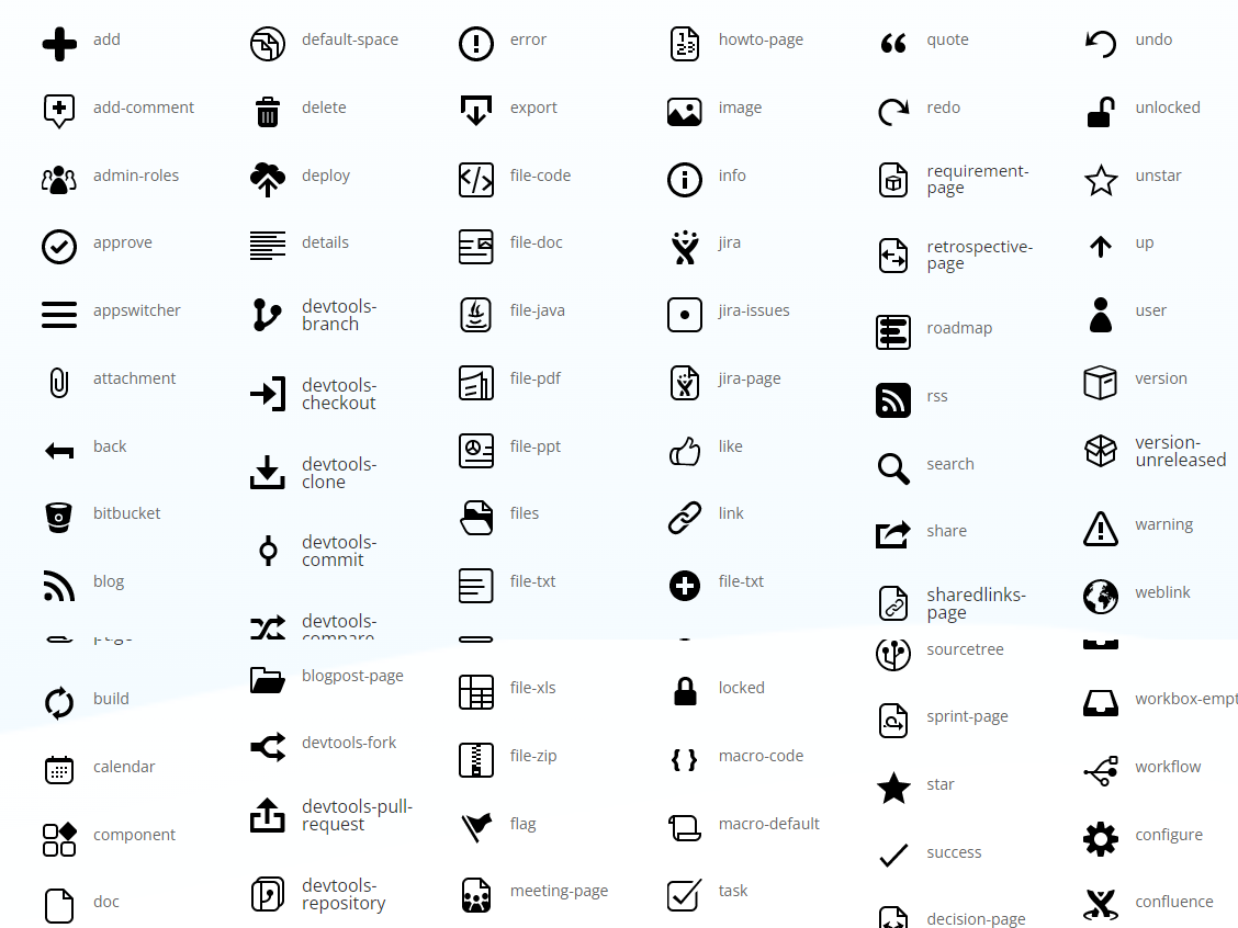
A set of icons is supported to create an attractive content
Useful tool
Panels are very useful to format Confluence content
Easy to use
No advanced skills is needed. Any users can make it
Getting Started
Cloud Documentation
Panels for Confluence Cloud — User guide
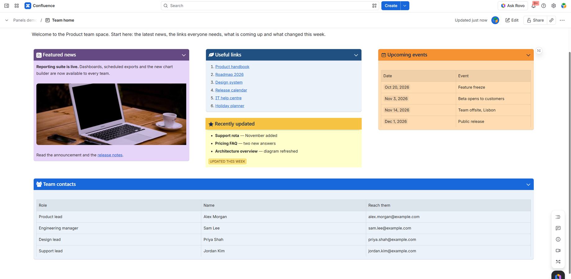
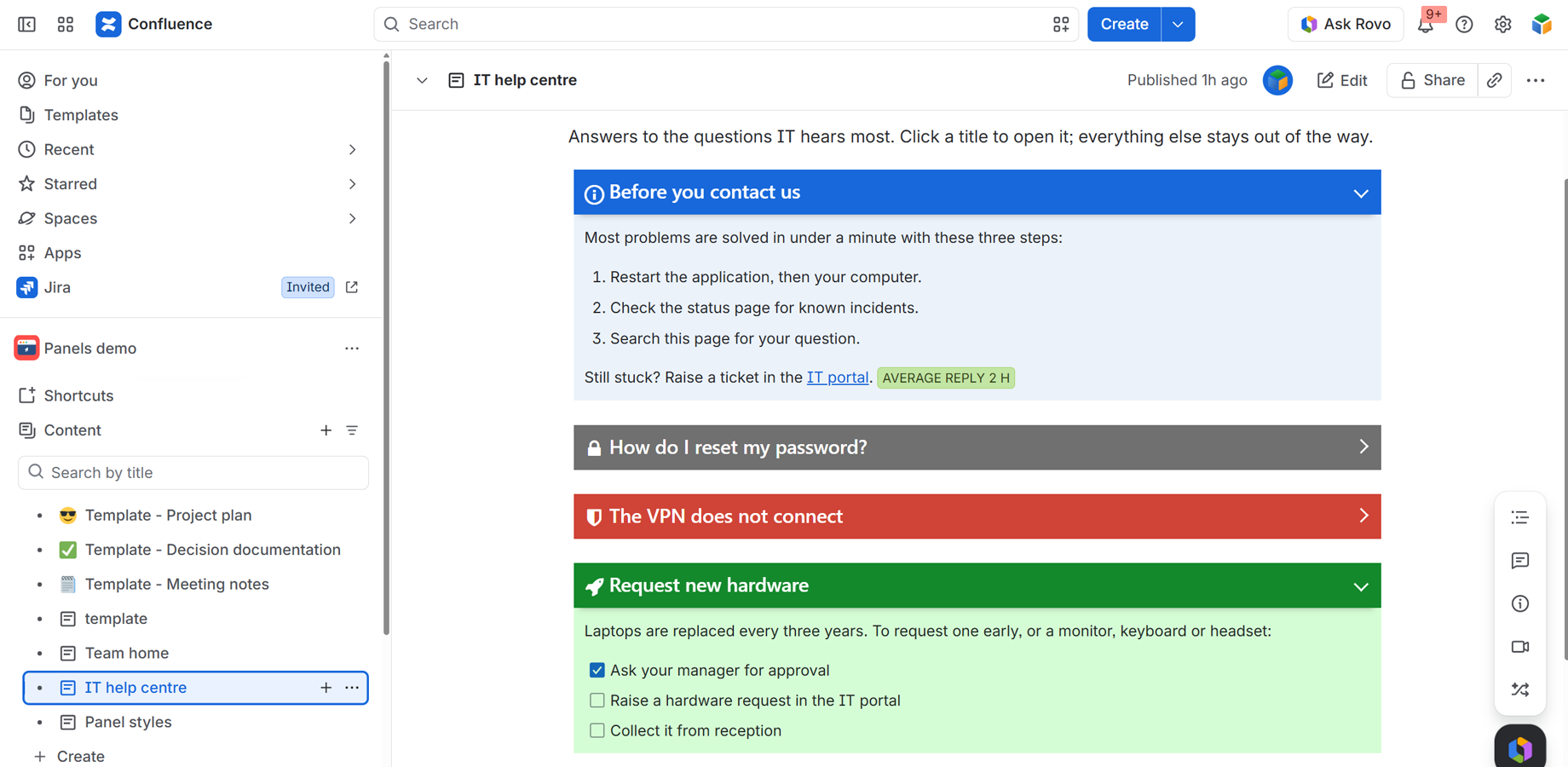
Panels puts part of a Confluence page in a coloured box with a title bar and an icon, so it stands out: instructions, warnings, contacts, summaries, links, news. You write the content in the normal editor; the panel frames it.
Moving from Confluence Data Center? See the migration guide.
1. Add a panel to a page
- Edit the page and type
/panels, then choose Panels. You can also find it in the macro browser (+ › Apps). - Type your content inside the macro box.
- Select the macro and click the Edit (pencil) icon to give the panel a title, a colour and an icon (see below).
- Publish the page.
A panel can hold anything a Confluence page can: text, lists, tables, images, task lists, code blocks, status lozenges, dates, mentions and other macros. The content is drawn by Confluence itself, so it looks exactly as it would anywhere else on the page.
A new panel has no title yet. Its coloured bar is shown empty until you set one, a reminder that the panel has settings.
2. Configure a panel
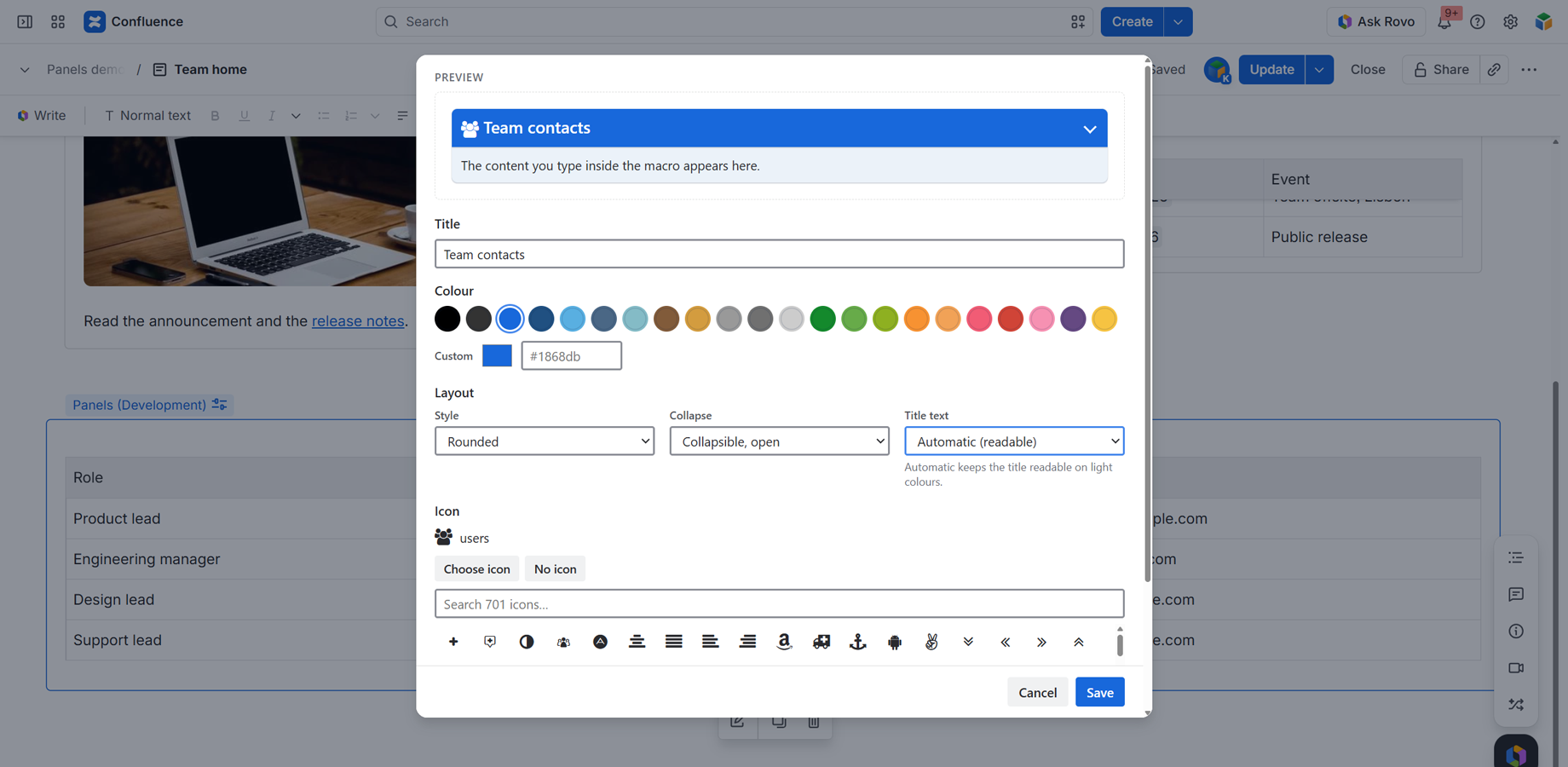
Select the macro while editing and click the Edit (pencil) icon. The configuration opens with a live preview at the top, so you see each change before saving. Click Save when you’re done.
2.1. Title
The text in the coloured bar. Plain text; it can be left empty.
2.2. Colour
Pick one of the 22 colours of the palette. Each colour has a matching pale shade, which frames the panel’s content:
Black, Black light, Blue, Blue dark, Blue cyan, Blue slate, Blue cool, Brown, Brown light, Gray, Gray dark, Gray light, Green, Green mid, Green lime, Orange, Orange light, Pink, Red, Rosie, Violet, Yellow
Hover over a colour to see its name. Need your brand colour? Use Custom: pick it with the colour picker or type its hex code (for example #1868db). The pale shade is worked out for you. Use palette goes back to the 22 colours.
2.3. Layout
| Setting | Options | Default |
|---|---|---|
| Style | Classic: a square bar with a soft shadow. Rounded: the panel as a card with rounded corners. Minimal: no filled bar; a coloured edge on the left and the title in colour | Classic |
| Collapse | Always open. Collapsible, open: readers can fold the panel by clicking its bar. Collapsible, closed: the panel starts folded, showing only its bar | Always open |
| Title text | Automatic (readable): white, or dark on light colours where white would be hard to read. White. Dark | Automatic |
With Automatic, the title is dark on the lighter colours: Blue cyan, Blue cool, Brown light, Gray, Gray light, Green mid, Green lime, Orange, Orange light, Rosie and Yellow. All the others keep a white title.
2.4. Icon
Each panel can have an icon in its bar, from 701 icons.
- Under Icon, click Choose icon.
- Type in the search box, for example rocket, calendar or warning, and click an icon.
- Click Save.
No icon removes it.
Icon names: most icons use their Font Awesome 4.5 names, such as rocket, paper-plane, database or shopping-cart. The icons of the Data Center app are included unchanged (info, warning, success, calendar, star, home…). Where a Font Awesome icon had the same name as a Data Center icon, it starts with fa- (for example fa-star, fa-calendar, fa-search, fa-user, fa-flag, fa-link). The search box is the quickest way to find one.
3. Reading a panel
- Collapsible panels show an arrow on the right of the bar. Click the bar to fold or unfold the panel.
- Dark mode: panels follow each reader’s Confluence theme. The bar keeps its colour; the frame around the content turns to a dark shade of it.
- Keyboard: a collapsible panel’s bar is a button. Press Tab to reach it and Enter or Space to fold or unfold it. Screen readers announce the bar as the panel’s heading, or as a button with its open/closed state.
4. Exporting and printing
A PDF or Word export can’t draw the app’s coloured frame, so each panel is exported as its title in bold followed by its content. Nothing is left out.
5. Panels inside panels
Confluence Cloud can’t place a macro inside another macro, so a panel can’t be added inside a panel. Pages migrated from Data Center that already have nested panels keep them: they are displayed as before, each with its own title and colour.
Panels — Data Center to Cloud migration guide
For Confluence administrators moving from Confluence Data Center to Confluence Cloud with the Confluence Cloud Migration Assistant (CCMA).
Pages that use Panels on Data Center keep their panels on Cloud: the same titles, colours, icons and content. Nothing needs to be rebuilt.
The one thing that matters most: upgrade the Data Center app to version 1.6.0 or later before you run the migration. Panels are matched to the Cloud app during the migration, by the Data Center app.
1. Overview
| Step | Where | When |
|---|---|---|
| 1. Upgrade Panels to 1.6.0 or later | Data Center | Before the migration |
| 2. Install Panels | Cloud | Before or after the migration |
| 3. Set Panels to Needed in cloud | CCMA | During planning |
| 4. Migrate your spaces | CCMA | |
| 5. Check a few pages; convert them to the Cloud editor if needed | Cloud | After the migration |
No app data needs to be transferred: panels live entirely in your page content, which CCMA migrates with the pages.
2. Upgrade the Data Center app
Administration › Manage apps › Panels › Update to 1.6.0 or later. A space migrated with an older version arrives with “Unknown macro” placeholders. Your content is still there, but installing the Cloud app afterwards does not fix those pages: the space has to be migrated again. Use the latest Migration Assistant too.
3. Install Panels on Cloud
Apps › Explore more apps, search for Panels, install. Before or after the migration.
The app asks for no Confluence permissions, so there’s nothing to approve during install.
4. Plan and migrate
On Assess your apps, set Panels to Needed in cloud, then migrate as usual.
5. After the migration
Open a few migrated pages with panels:
- The page shows the panels with their titles, colours and icons: done.
- The page is in the legacy editor: convert it to the Cloud editor. Confluence Cloud shows no app’s macros in the legacy editor (a platform rule). Until then the page shows each panel’s title and content without the coloured frame.
6. What carries over
| From Data Center | On Cloud |
|---|---|
| Title | ✅ Unchanged |
| The 22 colours | ✅ Same colours (Blue is a little brighter, see below) |
| Icons (Atlassian and Font Awesome) | ✅ Unchanged |
| Content (text, tables, images, other macros) | ✅ Unchanged |
| A panel inside another panel | ✅ Kept and displayed |
| Custom image icon (“Custom icon” field) | ❌ Not shown (see below) |
7. What’s different on Cloud
-
Blue looks brighter. The Blue colour is
#1868DBon Cloud; Data Center used#3572b0. -
Titles on light colours are dark. On Data Center the title was always white, which could not be read on yellow, light grey, orange and other light colours. Cloud uses dark text where white would be unreadable. To get white back, open the panel’s settings and set Title text to White.
-
Custom image icons are not shown. The Data Center “Custom icon” field (an attached image, like
786436/spaces.png) is not supported on Cloud. A panel that used one shows its regular icon if it also had one, otherwise no icon. Its title, colour and content are unaffected. Open the panel’s settings: it names the image and lets you choose one of 701 icons instead. -
Panel inside a panel. Migrated nested panels keep working, but Confluence Cloud can’t place a macro inside another macro, so new nested panels can’t be created.
8. New on Cloud
Collapsible panels, three styles (Classic, Rounded, Minimal), any custom colour, 701 icons with search, a live preview, and dark mode. See the user guide.
9. Troubleshooting
| What you see | Why | What to do |
|---|---|---|
| “Unknown macro” | Migrated with a Data Center app older than 1.6.0 | Upgrade to 1.6.0+, migrate the space again |
| Title and content, but no coloured panel | The page is still in the legacy editor | Convert it to the Cloud editor |
| A panel lost its image icon | Data Center “Custom icon” images aren’t shown on Cloud | Open the panel’s settings and choose an icon |
| “Error loading the extension” | The Cloud app isn’t installed | Install Panels from the Marketplace |
| A red “licence required” message | No active Cloud licence | Start a trial or subscribe |
Can I test first? Yes: migrate one test space, check it, then the rest.
Getting Started
Data center Documentation
Panel text macro
1 – Overview
Add macro that displays a panel text. Set macro parameters like icon, title and color.
2 – Insert macro
To insert the Panel text macro to a page:
1. In the Confluence editor, choose Insert > Other Macros.
2. Find and select the required macro.
Speeding up macro entry with autocomplete: Type { and the beginning of the macro name, to see a list of suggested macros. Details are in Using Autocomplete.
To edit an existing macro: Click the macro placeholder and choose Edit. A macro dialog window will open, where you can edit the parameters of the macro.
3 – Parameters
The full list of parameters is shown in the following table.
| Parameter | Required | Default | Description |
| Title | no | None | Specify a title for your panel. |
| Icon | no | None |
Choose an icon from our Icon Library. Just you need to enter icon’s name. |
| Color | no | blue | There are several special pastel colors: black, black-light, blue, blue-dark, blue-cyan, blue-slate, blue-cool, brown, brown-light, gray, gray-dark, gray-light, green, green-mid, green-lime, orange, orange-light, pink, red, rosie, violet, yellow. |
| Last | no | False | Indicate that panel is the last element. |
resources
Icons Library
A repository of icons for all your design needs, our Icons Library offers a diverse collection of visually appealing and functional icons.