Our Features
Make your intranet more interactive
Widget icon
Add macro that displays a widget icon. Set macro parameters like icon, title, color, link, size.
Widget text
Add macro with rich text body. It has the same parameters as widget icon macro.
Widget group
Organize widgets with some CSS options. Add a custom width, center widgets or you can add a class name.
Getting Started
Cloud Documentation
Widgets for Confluence Cloud — User guide
1. Overview
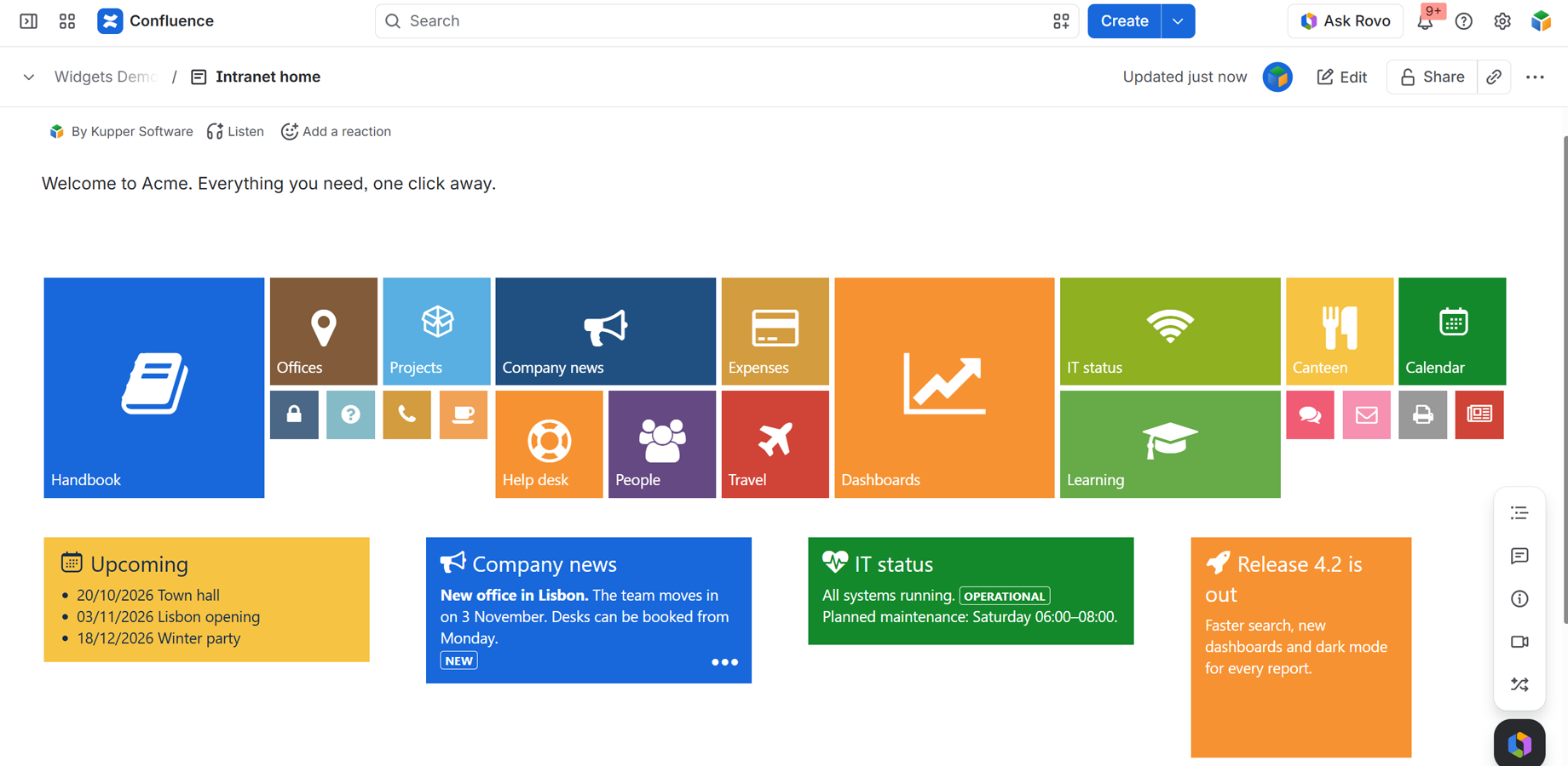
Widgets turns links and short texts into coloured tiles with big icons, the “metro” look of an intranet home page: a tile for the handbook, one for the help desk, one for the calendar, side by side.
There are three macros:
| Macro | What it is |
|---|---|
| Widget Group | A row of tiles, side by side. Start here. |
| Widget Icon | One tile: an icon and a label, linking to a page or a website |
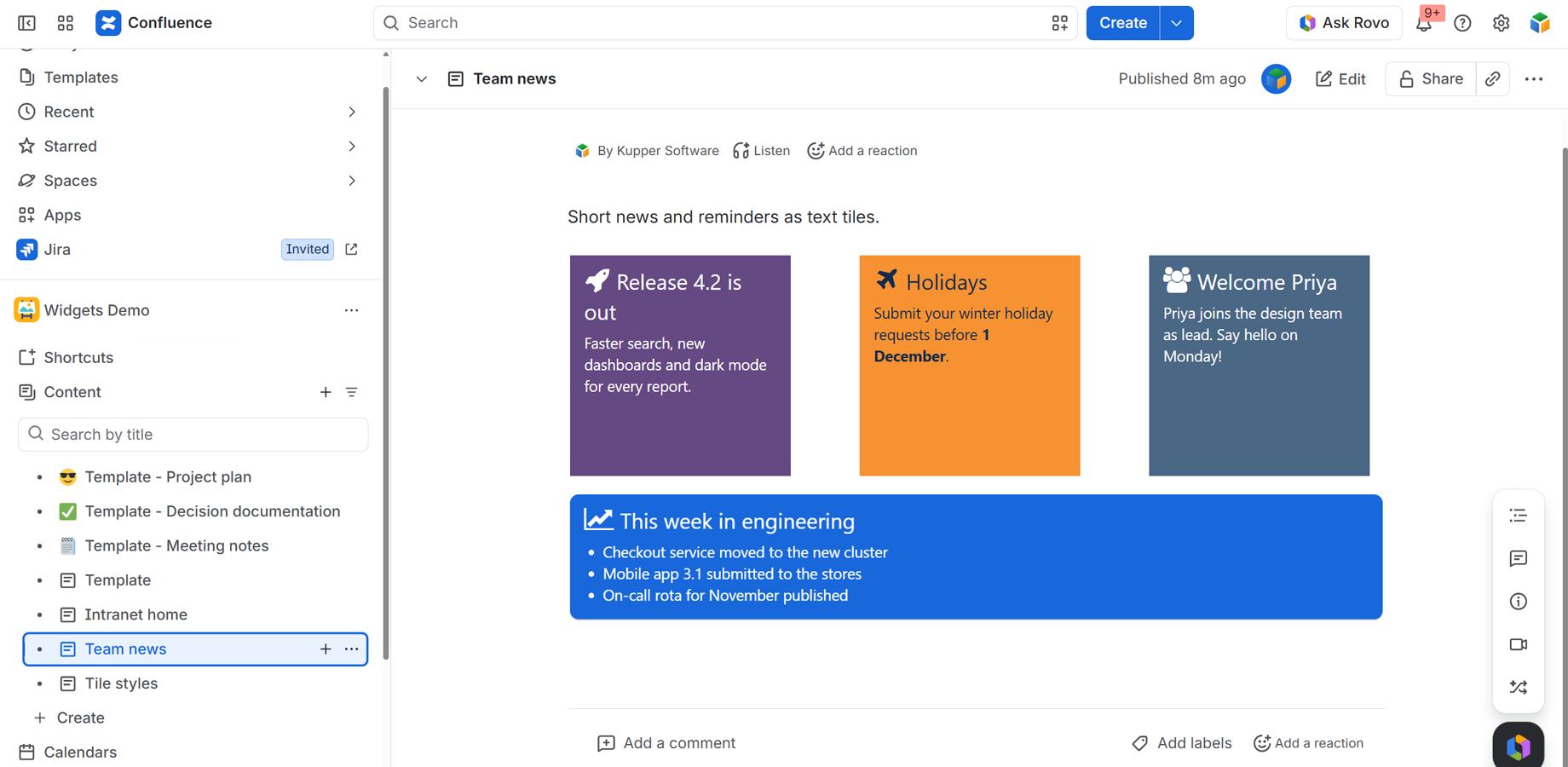
| Widget Text | One tile with an icon, a title and your own text |
Moving from Confluence Data Center? See the migration guide.
2. Build a row of tiles
- Edit the page, type
/widgetand choose Widget Group. - Select the group and click the Edit (pencil) icon.
- Under Tiles, click Add tile. Give it a title, a link, a colour, a size and an icon (see below). Add as many tiles as you need; Move up / Move down change their order. To edit a tile, click it in the list or click it in the preview.
- Click Save, then publish the page.
The tiles wrap onto new lines when the page is narrow. To start a new row on purpose, tick Start a new row after this tile on the last tile of a row.
Why a group? On Confluence Cloud each macro is shown in its own frame, the full width of the page. Two Widget Icon macros placed one after the other therefore appear one under the other, not side by side. Tiles in the same Widget Group always sit side by side.
You can also type text inside the Widget Group on the page, and insert Widget Icon macros inside it: they are shown as tiles in the group, after the tiles of its list.
Group settings
| Setting | What it does |
|---|---|
| Width (px) | Limits the group’s width, for example 315 for three square tiles per row. Empty: the page width |
| Centre the tiles | Centres each row of tiles |
3. Configure a tile
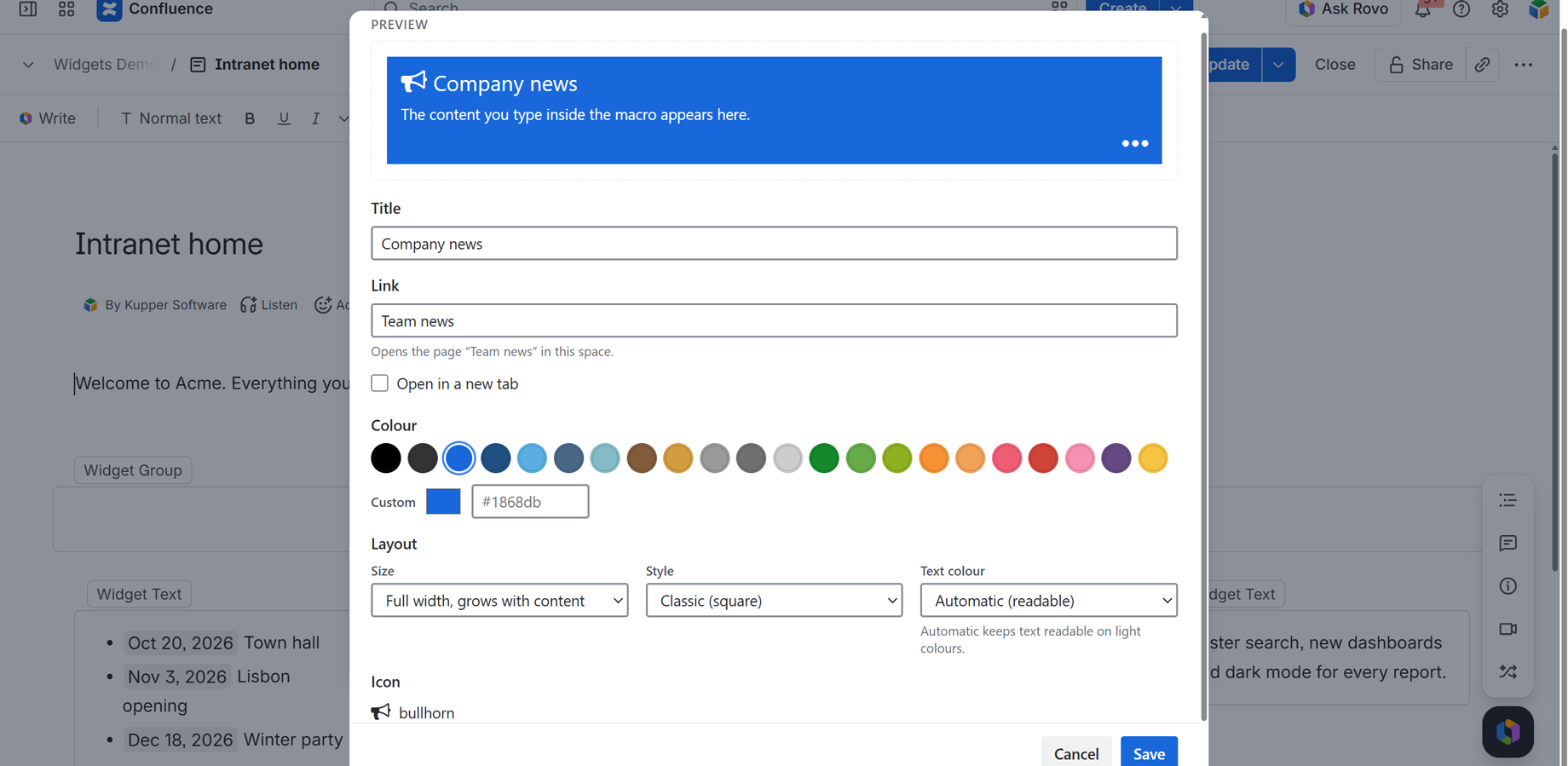
The same settings apply to a tile in a group’s list, a Widget Icon and a Widget Text. A live preview at the top shows each change before you save.
Title
The label on the tile. Plain text. A Widget Icon can do without one (just the icon).
Link
Where the tile goes when clicked. Either:
- a web address:
https://…,www.…ormailto:…, or - a Confluence page, by its title:
Team handbook(a page in the same space) orHR:Team handbook(the space key, a colon, then the title).
The line under the field tells you how the link was understood. Tick Open in a new tab to keep the reader on the current page. Leave the link empty for a tile that isn’t clickable.
Page links use the page title. If a page is renamed, update the tile’s link.
Colour
One of the 22 colours (hover a swatch to see its name), or Custom: any brand colour with the colour picker or a hex code such as #1868db. Use palette goes back to the 22 colours.
Layout
| Setting | Options | Default |
|---|---|---|
| Size (icon tiles) | Small 45 × 45, Square 100 × 100, Wide 205 × 100, Large 205 × 205 | Square |
| Size (text tiles) | Wide 205 × 100, Large 205 × 205, Big 415 × 205, Super 520 × 310, Full width (the height follows the text) | Large |
| Style | Classic (square corners), Rounded | Classic |
| Text colour | Automatic (readable): white, or dark on light colours where white would be hard to read. White. Dark | Automatic |
With Automatic, the text is dark on the lighter colours: Blue cyan, Blue cool, Brown light, Gray, Gray light, Green mid, Green lime, Orange, Orange light, Rosie and Yellow. All the others keep white text.
Text tiles of a fixed size show as much text as fits; choose Full width for longer text.
Icon
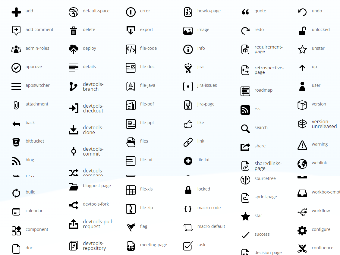
Click Choose icon, type in the search box (for example rocket, calendar, users) and click an icon. 701 icons are available. No icon removes it. A Widget Icon tile without an icon setting shows the gear icon.
Icon names: most use their Font Awesome 4.5 names (rocket, paper-plane, database). The icons of the Data Center app are included unchanged (home, calendar, configure, info, warning…). Where a Font Awesome icon had the same name as a Data Center icon it starts with fa- (fa-star, fa-search, fa-user). The search box is the quickest way to find one.
4. Widget Text: a tile with your own text
Insert Widget Text, type your text inside the macro box, then set its title, colour, size, icon and link with the pencil icon.
Short text, lists, links, mentions, dates and status lozenges are shown in the tile’s text colour, as on a classic intranet tile. Tables, images and other macros are shown too, drawn by Confluence itself.
A Widget Text can’t be placed inside a Widget Group on Cloud (Confluence Cloud can’t place one macro with a body inside another). Pages migrated from Data Center that already have them keep them.
Widgets — Data Center to Cloud migration guide
For Confluence administrators moving from Confluence Data Center to Confluence Cloud with the Confluence Cloud Migration Assistant (CCMA).
Pages that use Widgets on Data Center keep their tiles on Cloud: the same titles, icons, colours, sizes, links and text. One layout rule differs (tiles outside a group);
The one thing that matters most: upgrade the Data Center app to version 1.6.0 or later before you run the migration. Widgets are matched to the Cloud app during the migration, by the Data Center app.
Overview
| Step | Where | When |
|---|---|---|
| 1. Upgrade Widgets to 1.6.0 or later | Data Center | Before the migration |
| 2. Install Widgets | Cloud | Before or after the migration |
| 3. Set Widgets to Needed in cloud | CCMA | During planning |
| 4. Migrate your spaces | CCMA | |
| 5. Check a few pages; convert them to the Cloud editor if needed | Cloud | After the migration |
No app data needs to be transferred: widgets live entirely in your page content, which CCMA migrates with the pages.
1. Upgrade the Data Center app
Administration › Manage apps › Widgets › Update to 1.6.0 or later. A space migrated with an older version arrives with “Unknown macro” placeholders. Your content is still there, but installing the Cloud app afterwards does not fix those pages: the space has to be migrated again. Use the latest Migration Assistant too.
2. Install Widgets on Cloud
Apps › Explore more apps, search for Widgets, install. Before or after the migration. The app asks for no Confluence permissions, so there’s nothing to approve during install.
3–4. Plan and migrate
On Assess your apps, set Widgets to Needed in cloud, then migrate as usual.
5. After the migration
Open a few migrated pages with tiles, especially your intranet home pages:
- The page shows the tiles: done.
- The page is in the legacy editor: convert it to the Cloud editor. Confluence Cloud shows no app’s macros in the legacy editor (a platform rule). Until then the page shows each tile’s title as a link, and a text tile’s text, without the tiles.
- Tiles that were side by side are now one under another: see below.
What carries over
| From Data Center | On Cloud |
|---|---|
| Widget Icon, Widget Text, Widget Group | ✅ All three |
| Titles, icons (Atlassian and Font Awesome), sizes | ✅ Unchanged |
| The 22 colours | ✅ Same colours (Blue is a little brighter, see below) |
| Links to pages | ✅ Kept, by page title, as on Data Center |
Links typed as a full Data Center page address (…/display/SPACE/Page+title, …/viewpage.action?spaceKey=…&title=…, …/spaces/SPACE/pages/123/Page+title) |
✅ Opened as the same page on Cloud, automatically. Nothing to edit or re-save |
Links typed as a page-id address (…/viewpage.action?pageId=123456) |
❌ Still point at the Data Center server (page ids change in a migration). Edit the tile’s link |
| Text in text tiles | ✅ Unchanged |
| Tiles in a Widget Group, side by side, “Last” row breaks | ✅ Unchanged |
| Group width and centring | ✅ Unchanged |
| A group inside a group, Info/Tip/Note/Warning macros in a group | ✅ Kept and displayed |
| Group “Class” (custom CSS class) | ❌ No effect (see below) |
What’s different on Cloud
- Tiles outside a group are shown one under another. On Data Center, tiles placed one after another on a page lined up side by side. On Cloud, each macro is shown in its own frame, the width of the page, so tiles that are not inside a Widget Group appear in a column. Tiles inside a Widget Group are unaffected. To restore a row, edit the page, insert a Widget Group, and cut and paste the tiles into it, or recreate them in the group’s tile list.
- Blue looks brighter. The Blue colour is
#1868DBon Cloud; Data Center used#3572b0. - Text on light colours is dark. On Data Center tile text was always white, which could not be read on yellow, light grey, orange and other light colours. Cloud uses dark text where white would be unreadable. To get white back, open the tile’s settings and set Text colour to White.
- Group “Class” has no effect. Custom site stylesheets can’t style a Cloud app. The value is kept, and the group’s settings mention it.
- New text tiles can’t be put in a group. Confluence Cloud can’t place a macro with a body inside another one. Migrated groups that contain text tiles keep them.
New on Cloud
A tile list in each Widget Group, links to web addresses, open in a new tab, any custom colour, rounded tiles, full-width text tiles, 701 icons with search, a live preview and dark mode. See the user guide.
Troubleshooting
| What you see | Why | What to do |
|---|---|---|
| “Unknown macro” | Migrated with a Data Center app older than 1.6.0 | Upgrade to 1.6.0+, migrate the space again |
| Tile titles as links, but no tiles | The page is still in the legacy editor | Convert it to the Cloud editor |
| Tiles in a column instead of a row | They are not inside a Widget Group | Put them in a Widget Group (see above) |
| A tile still opens the old Data Center server | Its link is a page-id address (viewpage.action?pageId=…) |
Open the tile’s settings and set the link to SPACEKEY:Page title |
| A tile’s link doesn’t find its page | The page was renamed, or its space key changed | Open the tile’s settings and correct the link (SPACEKEY:Exact page title) |
| “Error loading the extension” | The Cloud app isn’t installed | Install Widgets from the Marketplace |
| A red “licence required” message | No active Cloud licence | Start a trial or subscribe |
Can I test first? Yes: migrate one test space, check it, then the rest.
Getting Started
Data Center Documentation
Widget Icon macro
1 – Overview
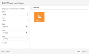
Add macro that displays a widget icon. Set macro parameters like icon, title, color, link and size.
2 – Insert macro
To insert the Widget Icon macro to a page:
1. In the Confluence editor, choose Insert > Other Macros.
2. Find and select the required macro.
Speeding up macro entry with autocomplete: Type { and the beginning of the macro name, to see a list of suggested macros. Details are in Using Autocomplete.
To edit an existing macro: Click the macro placeholder and choose Edit. A macro dialog window will open, where you can edit the parameters of the macro.
3 – Parameters
The full list of parameters is shown in the following table.
| Parameter | Required | Default | Description |
| Title | no | None |
Specify a title for your widget. When size widget is small, we recommend to keep title parameter empty. |
| Icon | no | None |
Choose an icon from our Icon Library. Just you need to enter icon’s name. |
| Size | no | square |
Choose a widget size. small (45px * 45px), square (100px * 100px), wide (205px * 100px), large (205px * 205px) |
| Color | no | blue | There are several special pastel colors: black, black-light, blue, blue-dark, blue-cyan, blue-slate, blue-cool, brown, brown-light, gray, gray-dark, gray-light, green, green-mid, green-lime, orange, orange-light, pink, red, rosie, violet, yellow. |
| Last | no | False | Indicate that widgetis the last element. |
4 – Examples
Example 1:
Example 2:
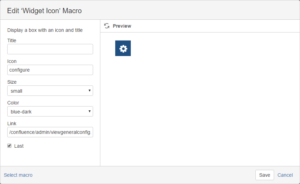
Widget Text macro
1 – Overview
Add macro with rich text body. It has the same parameters as widget icon macro.
2 – Insert macro
To insert the Widget text macro to a page:
1. In the Confluence editor, choose Insert > Other Macros.
2. Find and select the required macro.
Speeding up macro entry with autocomplete: Type { and the beginning of the macro name, to see a list of suggested macros. Details are in Using Autocomplete.
To edit an existing macro: Click the macro placeholder and choose Edit. A macro dialog window will open, where you can edit the parameters of the macro.
3 – Parameters
The full list of parameters is shown in the following table.
| Parameter | Required | Default | Description |
| Title | no | None |
Specify a title for your widget. When size widget is small, we recommend to keep title parameter empty. |
| Icon | no | None |
Choose an icon from our Icon Library. Just you need to enter icon’s name. |
| Size | no | square |
Choose a widget size. small (45px * 45px), square (100px * 100px), wide (205px * 100px), large (205px * 205px) |
| Color | no | blue | There are several special pastel colors: black, black-light, blue, blue-dark, blue-cyan, blue-slate, blue-cool, brown, brown-light, gray, gray-dark, gray-light, green, green-mid, green-lime, orange, orange-light, pink, red, rosie, violet, yellow. |
| Link | no | None |
Add a widget’s link. Two options are available:
|
| Last | no | False | Indicate that widgetis the last element. |
resources
Icons Library
A repository of icons for all your design needs, our Icons Library offers a diverse collection of visually appealing and functional icons.