Tabs
An easy way to build a responsive and user-friendly tabs

Our Features
Structure your content
Different visual schemes
Use macro parameters to create many different and beautiful tabs skin.
Easy to use
A user-friendly macros
Useful
Tabs are very useful to format Confluence content

Getting Started
Documentation
Tabs Group macro
1 – Overview
Add macro to build a responsive and custom tabs. You need to set macro parameters and add some Tabs element.
2 – Insert macro
To insert the Tabs Group macro to a page:
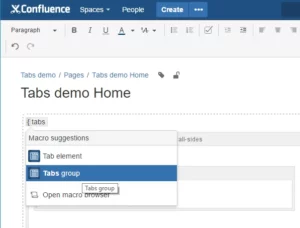
1. In the Confluence editor, choose Insert > Other Macros.
2. Find and select the required macro.
Speeding up macro entry with autocomplete: Type { and the beginning of the macro name, to see a list of suggested macros. Details are in Using Autocomplete.
To edit an existing macro: Click the macro placeholder and choose Edit. A macro dialog window will open, where you can edit the parameters of the macro.
3 – Parameters
The full list of parameters is shown in the following table.
|
Parameter
|
Required
|
Default
|
Description
|
|---|---|---|---|
| Navigation color | yes | blue | There are several special pastel colors: black, blue, navy, brown, green, orange, pink, red, violet, yellow. |
| Icon | yes | top |
Indicate icon’s position. Three options are available: only, left, top. |
| Border | yes | none |
Three options are available: none, vertical-sides, all-sides. |
| Content background color | yes | white | There are several special pastel colors: white, blue-light, gray-light, green-light, orange-light, red-light, violet-light, yellow-light. |
4 – Examples
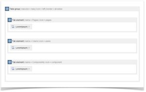
Tabs Element macro
1 – Overview
This macro can only be used with Tabs Group macro.
2 – Insert macro
To insert the Tabs Element macro to a page:
1. In the Confluence editor, choose Insert > Other Macros.
2. Find and select the required macro.
Speeding up macro entry with autocomplete: Type { and the beginning of the macro name, to see a list of suggested macros. Details are in Using Autocomplete.
To edit an existing macro: Click the macro placeholder and choose Edit. A macro dialog window will open, where you can edit the parameters of the macro.
3 – Parameters
The full list of parameters is shown in the following table.
|
Parameter
|
Required
|
Default
|
Description
|
|---|---|---|---|
| Name | yes | none |
The name of tab. |
| Icon | yes | top |
Choose an icon from our Icon Library. Just you need to enter icon’s name. |
Customize Tabs group color: How to customize existing color
A use case
We want to change the color of the item “blue” listed in the navigation color.
Solution
Add the following CSS and change “@blue” by your desired hex color:
/* default blue */.kupper-tabs .c-tabs-nav .nav-blue{ color: #fff !important; background-color: @blue;}.kupper-tabs .c-tabs-nav__link.is-active.nav-blue{ color: @blue !important; background-color: #fff;}/**border option */.kupper-tabs .c-tab.nav-blue.border-vertical-sides{ border-bottom: 3px solid @blue;}.kupper-tabs .c-tabs-nav__link.is-active.nav-blue.border-vertical-sides{ border-top: 3px solid @blue;}.kupper-tabs .c-tab.nav-blue.border-all-sides{ border: 2px solid @blue;}.kupper-tabs .c-tabs-nav__link.is-active.nav-blue.border-all-sides{ border-top: 2px solid @blue; border-right: 2px solid @blue; border-left: 2px solid @blue; margin-bottom: -2px;}/* end default blue */Customize Tabs group color: How to add a new color
Case
We want to add a new color.
Solution
In two steps:
- Add a class name in the CSS class macro parameter like mycustomclass
- Add the following CSS:
.kupper-tabs .c-tabs-nav .mycustomclass{ color: #fff !important; background-color: #dc3126;}.kupper-tabs .c-tabs-nav__link.is-active.mycustomclass{ color: #dc3126 !important; background-color: #fff;}/**border option */.kupper-tabs .c-tab.mycustomclass.border-vertical-sides{ border-bottom: 3px solid #dc3126;}.kupper-tabs .c-tabs-nav__link.is-active.mycustomclass.border-vertical-sides{ border-top: 3px solid #dc3126;}.kupper-tabs .c-tab.mycustomclass.border-all-sides{ border: 2px solid #dc3126;}.kupper-tabs .c-tabs-nav__link.is-active.mycustomclass.border-all-sides{ border-top: 2px solid #dc3126; border-right: 2px solid #dc3126; border-left: 2px solid #dc3126; margin-bottom: -2px;}How to add CSS style sheets on Confluence
- Go to the space and choose Space tools > Look and Feel from the bottom of the sidebar
- Choose Stylesheet then Edit.
- Paste your custom CSS into the text field.
- Save your changes. The new CSS will be visible on all content pages in the space.
- Choose
 > General Configuration > Stylesheet.
 - Choose Edit.
- Paste your custom CSS into the text field.
-
Choose Save.
resources
Icons Library
A repository of icons for all your design needs, our Icons Library offers a diverse collection of visually appealing and functional icons.